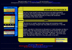
Here is a gif picture showing how the page is supposed to look:

This page is supposed to be reminiscent of a computer screen in the Next
Generation era of Star Trek. The "Quick Navigation" panel to the left
is created in shades of blue for the outlining graphic with shades of
yellow and orange for the "buttons". The main screen is also done in shades
of blue.
To make the size of the graphics variable so that they could work with any size font the viewer might be using (and to make the downloading faster), I used tables to produce much of the graphics involved. The background of the table's cells can be colored to produce much of the outlining graphic. Then, a few other gif graphics are added for spice (including two animated gifs to add some flare).
If you would like to comment on the page or make suggestions, just drop me a line.